 Русский
 English
CURTAINS FOR BLONDY. How the color of hair influences on preferences in design
WilliZ continues to study classics with the aim to find useful ideas for designers of curtains.
15.02.2015,
Today we have a legendary Swiss theorist, whose works about colors based all training courses for artists. Of course, it is Johannes Itten.
But now we want to stop not on classical color combinations, Itten has a very interesting chapter which is called "Subjective Relation to Colour" in his classical work "Art of Colour".
But now we want to stop not on classical color combinations, Itten has a very interesting chapter which is called "Subjective Relation to Colour" in his classical work "Art of Colour".
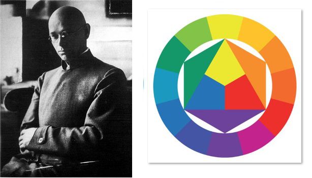
“Rules for designers of curtain” by Johannes Itten.
Rule №1. There are no convertible and harmonious colors for all clients
Perception of color is always a subjective thing. The things that one client and you like can be absolutely refused by other client, and it is normal.
"The combinations of colors that are harmonious for you and created by you, these combinations of colors present your subjective perception of color. These are subjective colors".
Once Itten made the following experiment with his pupils.
"Well, – I said, – let each of you give me a combinations of paints which you find pleasant and harmonious". At once the pupils calmed down, and all began to prove me that my color combinations were not right.
In one hour their shits of paper were on the floor for a common viewing. Each pupil made on his paper a few emotional and close one to another combinations. But all works strongly differed from each other. Pupils recognized with a surprise that each of them has own thought about harmony of color combinations".
Rule No. 2. Preferences in a shape and a size of color spots, and in the type of patterns – are also subjective
As there is no ideally harmonious color, so there are no harmonious patterns and shapes.
"In my researches about subjective perception of colors, I found out that not only the choice and combinations of colors, but and a size of color spots and orientation of dabs can be very characteristic for this or that artist. Some of them prefer vertical dabs, others prefer horizontals and diagonals.
According to this, for example, shapes of the heads become narrow and vertical, or, on the contrary, wide and horizontal. The choice of orientation of dab reveals thinking and expression of feelings. As, for example, atype of a hairdress can tell much about.
As hair can adjoin to the head, lie as rhythmical waves, or be tousled and hang down as chaotic locks, so can color spots be accuratelly outlined or "", merged, or not clear and in disorder".
Rule №3. The designer can't rely on his taste and impose it on clients
If you work in the mass market and your aim is the maximum number of clients, don't try to convincea client in your preferences. Minimum – you will lose your client, maximum – you will spoil his life.
“People, who professionally work with a color can depend on their own preferences of colors. It can lead to misunderstanding and disputes, especially in cases when one subjective opinion faces with another."
"If in personal color sympathies of this or that architect a gray-blue tone prevails, they will prefer to make dwelling and trade rooms in pleasant tones for them.
Customers who also like these colors, will be very happy, but for another that think about orange or green color, these gray-blue rooms will seem unpleasant and these people will feel here bad … Unpleasant colors can provoke mental disorders for people that are sensitive to colors.
“Owners of flowers shops, who should serve a special category of clients, will achieve success if they try to adapt themselves for the tastes of clients instead of imposing their own tastes".
Rule No. 4. Don't draw hasty conclusions about preferences of the client
People following the fashion, circumstances, can surround themselves not with the colors that seem harmonious for them.
" It is necessary to approach very carefully to experiments with subjective color preferences. At the beginning … it is necessary to avoid any hint that "subjective color" can reveal a character or a mood,a way of thinking and feelings. Many people don't want to show anybody what they are".
" It is necessary to approach very carefully to experiments with subjective color preferences. At the beginning … it is necessary to avoid any hint that "subjective color" can reveal a character or a mood,a way of thinking and feelings. Many people don't want to show anybody what they are".
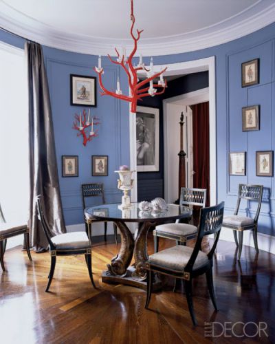
Rule №5. The color of hair and eyes influences on perception of color
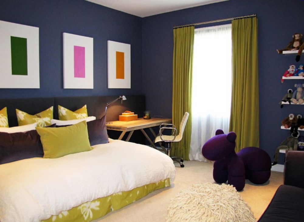
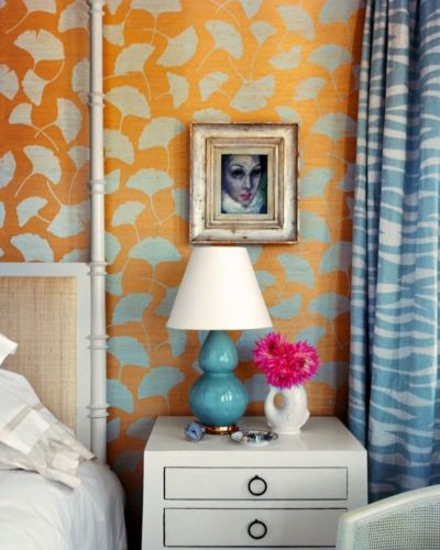
Blondes often prefer pure colors and color contrast
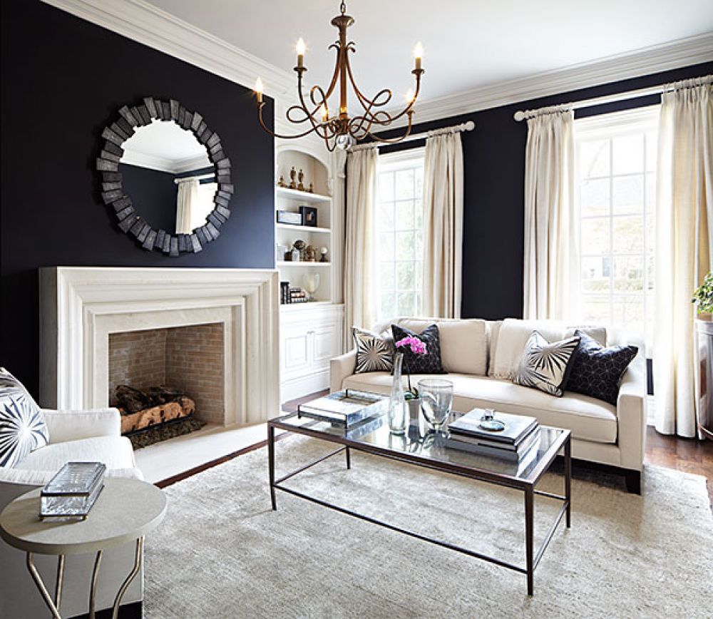
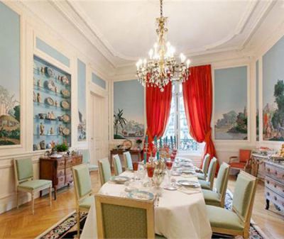
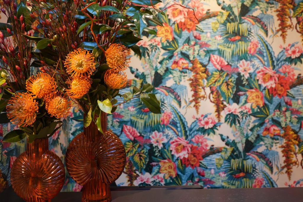
Blond-hair and blue-eyed schoolgirls with pink face skin, as a rule, use pure colors with a big number of distinguishable tones. The main contrast for them is a color contrast. Depending on the living position of people of this type the color preferences of their works can be more pale or brighter." For this type of people is pleasant themes as Spring, Kindergarden, Epiphany, Festival of Flowers, Morning in the garden and etc.
Her natural etudes have to be florid and without light and dark colors contrasts.
Her natural etudes have to be florid and without light and dark colors contrasts.
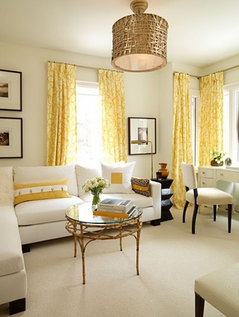
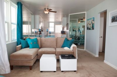
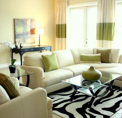
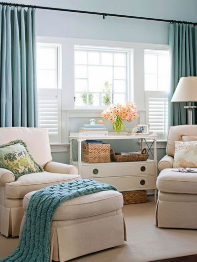
Collection which was collected by WilliZ after Itenn's descriptions about blondes.
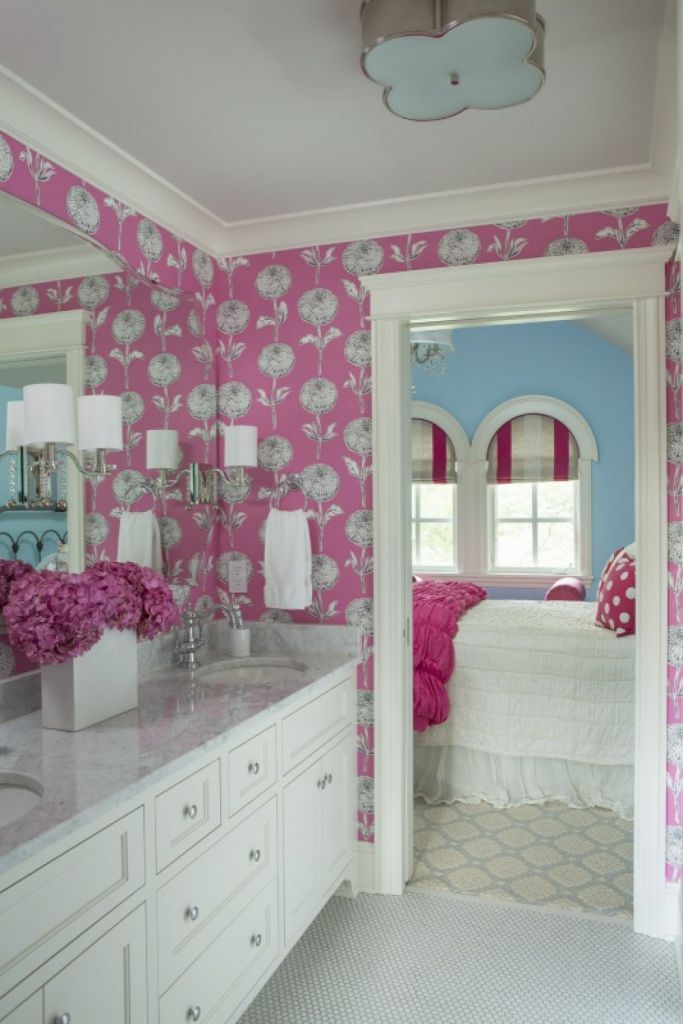
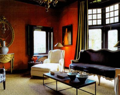
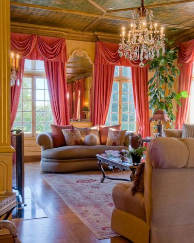
BRUNETTES LIKE TO USE BLACK COLOR
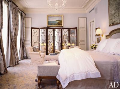
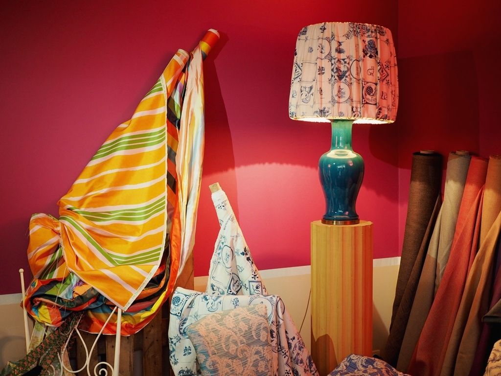
"People with black hair, with dark skin and dark brown eyes are another type of people. The main role in their combinations is given to black color, and pure colors just accompany the black. In dark tones the power of color noises and bubbles. When working with nature soft coal and white paint should be used, without geometrical outlines".
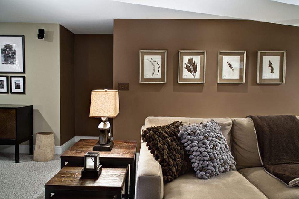
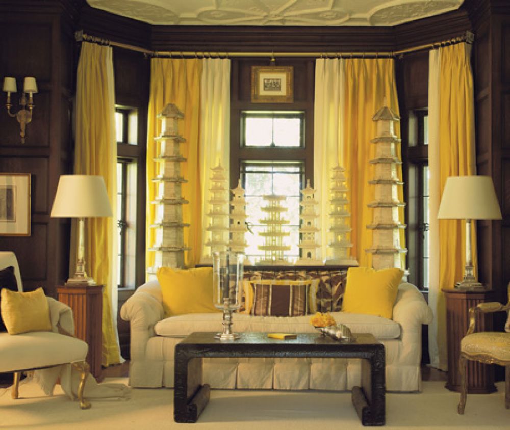
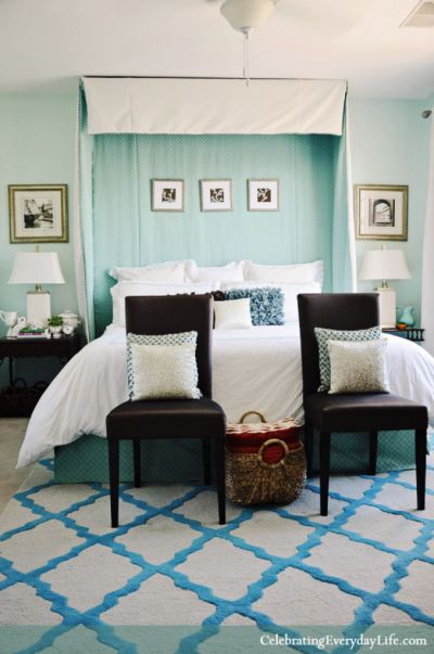
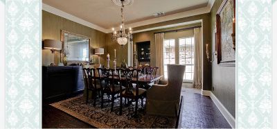
Collection which was collected by WilliZ after Itenn's descriptions about brunettes.
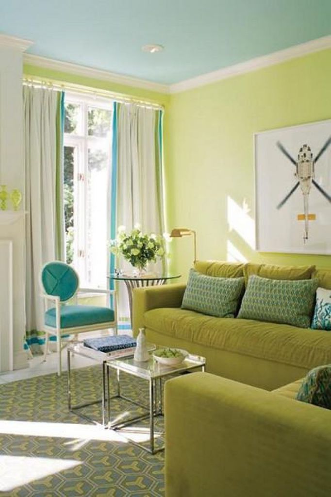
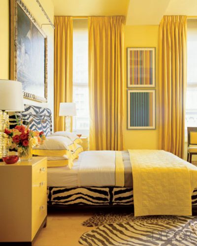
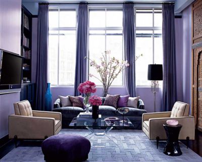
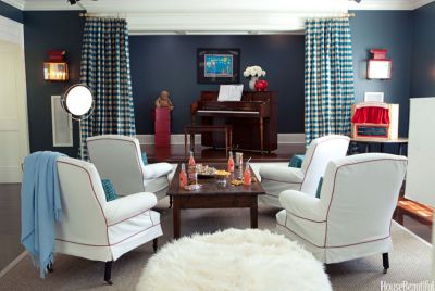
THE RED-HAIRED LADIES PREFER INTENSIVE COLORS
"The schoolgirl with red hair and pink skin preferred to work with very intensive colors. Her subjective colors were yellow, red and blue in its contrast sounding. According to it I asked her to write a bouquet of flowers. It was obvious that she was happy about it. I advised her to be limited only with her subjective color preferences because these colors could be experienced and endured by her in a fully".
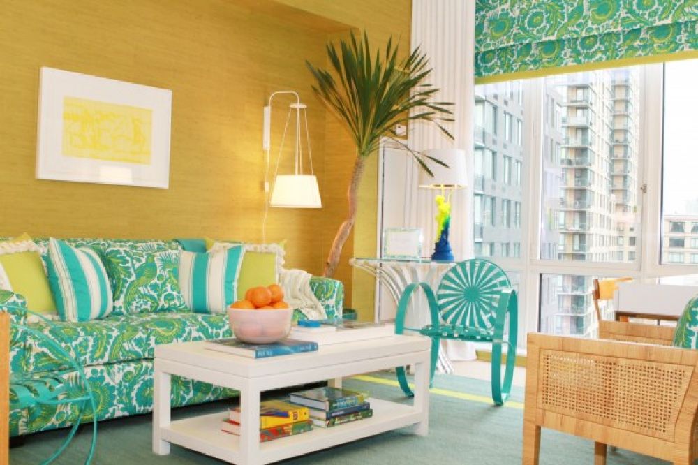

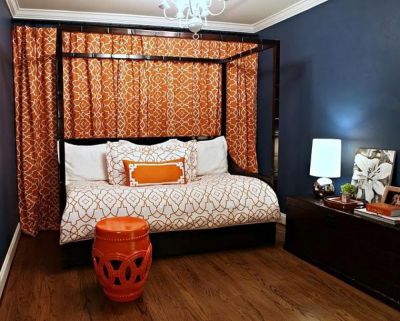
Collection which was collected by WilliZ after Itenn's descriptions about red-haired.
Rule No. 6. Don't estimate the color preferences literally
For understanding color preferences of clients you shouldn't ask him a question in directly: "What do you think about red with blue?". It is important to estimate his relation with various color compositions, a saturation of color, graphic patterns.
"The one who wants to interpret subjective color manifestations, shouldn't stop on an assessment only of various color characteristics and their independent expressiveness.
The most important thing here is the common tonality in general, then an arrangement of every color, their movement, brightness, lightness or, on the contrary, subdued colors, proportionality, structure and rhythms of color construction".
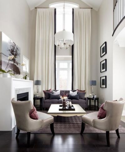
P.S. Rule №7. From WilliZ
Use a definition of color preferences of the client, "to hit the nail" in his inquiries and to get the order. For this purpose don't rely on your experience and recent orders, use an opportunity to create a collection of designs of different color solutions, which will be suitable for the type of the room and the color of the walls. The more ideas you have the more chances you get.
To create a selection of ideas, just create a new collection in the section Fast ideas. williz.ru/curtainlog/free/
Foto
oharainteriors.com | simplystunningspaces.net | instudioandco.com | carolsdraperies.com | karendavisdesign.com | karendavisdesign.com | bella-furnishing.com | decorativetouchltd.com | laurahaydesign.com | agirlandakey.blogspot.com | tzsdesign.com | laurau.com | laurau.com | cedarhillfarmhouse.com | lorirourkinteriors.com | pamelahopedesigns.com | laurahaydesign.com | housebeautiful.com | designkastle.com | curtainscolors.com | curtainscolors.com | roomenvy.co.uk | jrid.com | millerdesignco.com | garrisonhullinger.com | garrisonhullinger.com | karendavisdesign.com | rchitecturaldigest.com | gatewayinteriordesign.com
Read more
ART-CLASSICS OF COLOUR. Cupid and Psyche williz.ru/info/223/
ART-CLASSICS OF COLOUR. Beautiful Jane williz.ru/info/219/
ART-CLASSICS OF COLOUR. Fair Rosamund williz.ru/info/215/
ART-CLASSICS OF COLOUR. Interiors in the Alphonse Mucha style williz.ru/info/211/
THE MAIN COLOR. 10 beautiful examples of stress on curtains williz.ru/info/231/
ART-CLASSICS OF COLOUR. Beautiful Jane williz.ru/info/219/
ART-CLASSICS OF COLOUR. Fair Rosamund williz.ru/info/215/
ART-CLASSICS OF COLOUR. Interiors in the Alphonse Mucha style williz.ru/info/211/
THE MAIN COLOR. 10 beautiful examples of stress on curtains williz.ru/info/231/
Читайте также
Получайте полезные рассылки от WilliZ
Подписываясь на рассылку, вы подтверждаете согласие с «Соглашением на обработку персональных данных».
Вам также может быть интересно


Получайте полезные рассылки от WilliZ
Подписываясь на рассылку, вы подтверждаете согласие с «Соглашением на обработку персональных данных».


